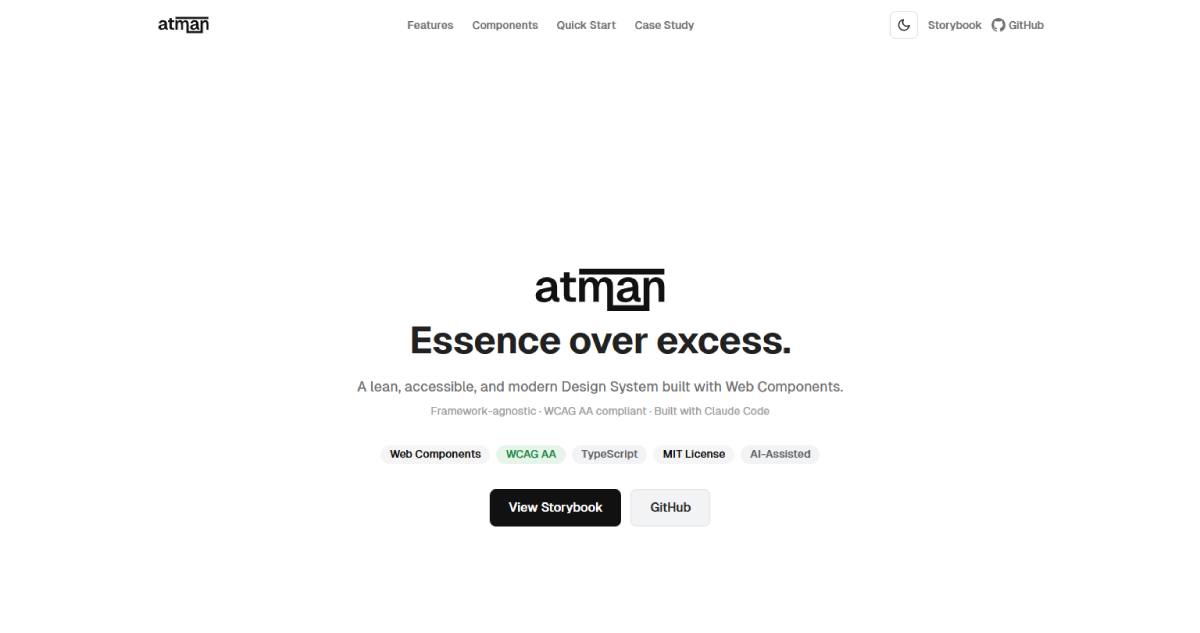
Atman
A lean, accessible design system built with Web Components. Framework-agnostic. TypeScript-first.
Overview
Atman is a production-ready design system built with Web Components (Lit). It works with any framework—React, Vue, Angular, Svelte, or plain HTML—with full TypeScript support, dark mode, and WCAG AA compliance out of the box.
The Challenge
Design systems often lock teams into specific frameworks. When the framework changes, the system breaks. I set out to build a truly portable component library that prioritizes accessibility and developer experience without framework lock-in.
My Role
Everything from concept to npm publish: design system architecture, visual design, component API design, TypeScript implementation, Storybook documentation, design token system, and project site — built in close collaboration with Claude Code as development partner.
Design Principles
- Essence over excess: Every decision serves a purpose
- Accessible by default: Keyboard navigation, screen readers, focus management, reduced motion
- Light & dark themes: System preference detection + manual toggle
- TypeScript-first: Full IntelliSense for every prop and event
Components Delivered
24 components across six categories:
- Primitives: Button, Badge, Avatar, Icon
- Form Controls: Input, Select, Checkbox, Radio, Switch, Textarea
- Feedback: Alert, Progress, Skeleton, Tooltip
- Layout: Card, Divider
- Navigation: Modal, Tabs, Breadcrumb, Pagination, Dropdown, Accordion
- Data Display: Table
Tech Stack
- Lit (Web Components)
- TypeScript
- Storybook 8
- Lucide Icons
- CSS Custom Properties
- Figma Tokens Studio Integration
What I Learned
Developer experience is a design problem. Building framework-agnostic required more investment in documentation and API clarity than I anticipated. If developers can't predict how a component behaves, they won't use it — no matter how polished it looks. The time spent on TypeScript types, consistent prop naming, and Storybook examples paid off more than any visual refinement.
Results
Project Gallery