Listo 360
From Visual Chaos to Decision Clarity — Transforming a feature-rich but confusing tool into an interface where critical insights surface immediately.
Overview
I led the complete UX/UI redesign of Listo 360, a management and analytics platform for high-end engineering and facilities operations. The goal: transform a feature-rich but confusing tool into an interface where critical insights surface immediately.
The Problem
Listo 360 had grown organically, accumulating features without a cohesive information architecture. Engineers and facilities managers wasted hours navigating disconnected modules, struggling to identify critical issues. The tool had the data—but users couldn't find it when it mattered.
My Role
Lead Designer — UX/UI Redesign at Verity (2020)
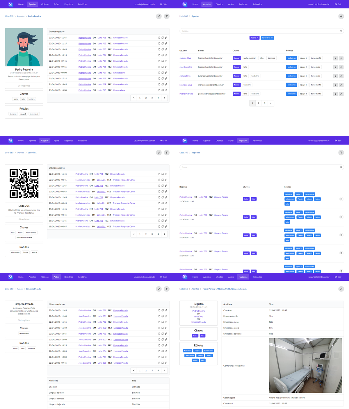
I restructured the information architecture from scratch, created a unified navigation system, redesigned data visualizations for faster pattern recognition, and delivered high-fidelity prototypes for stakeholder validation.
Approach
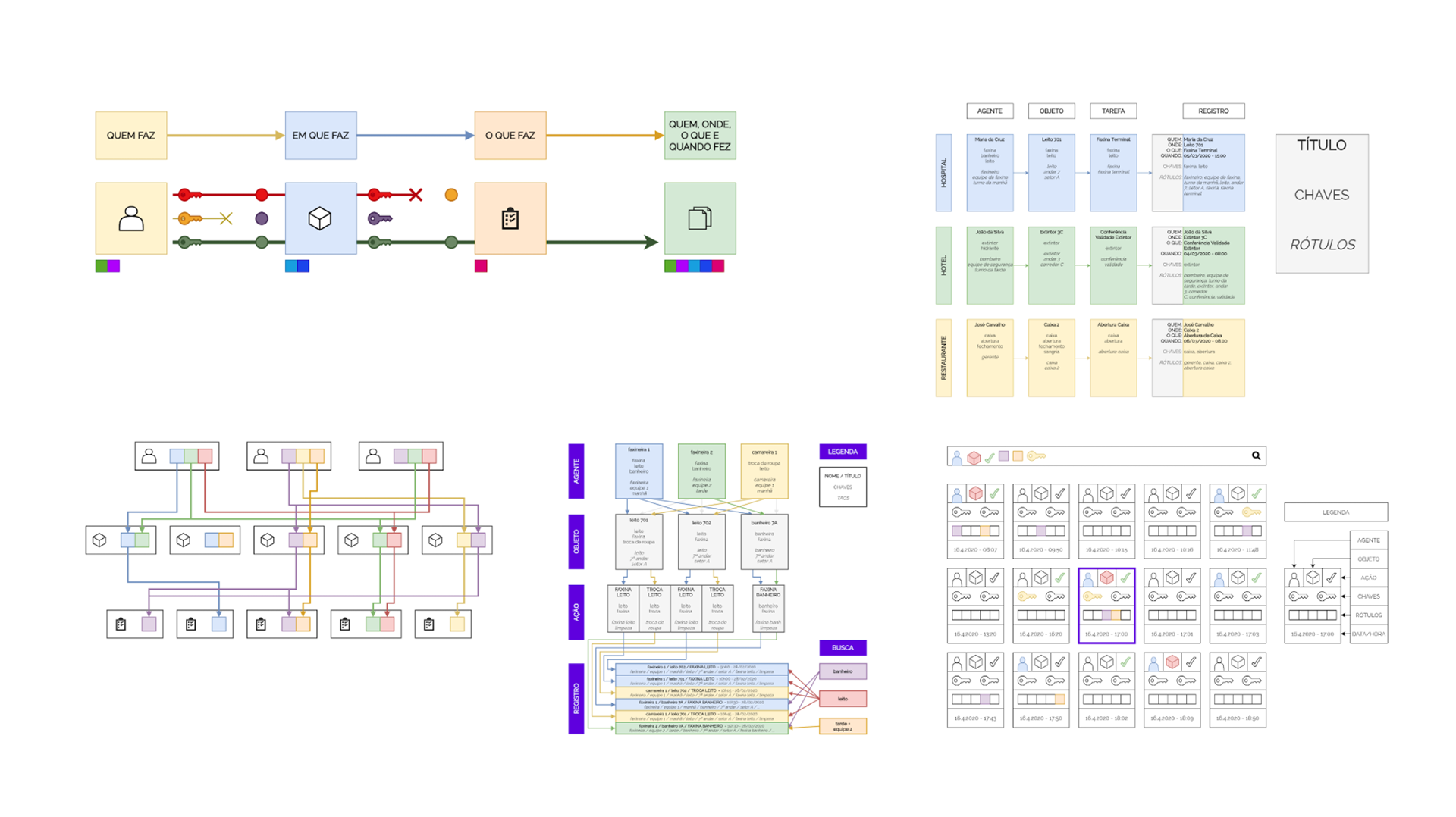
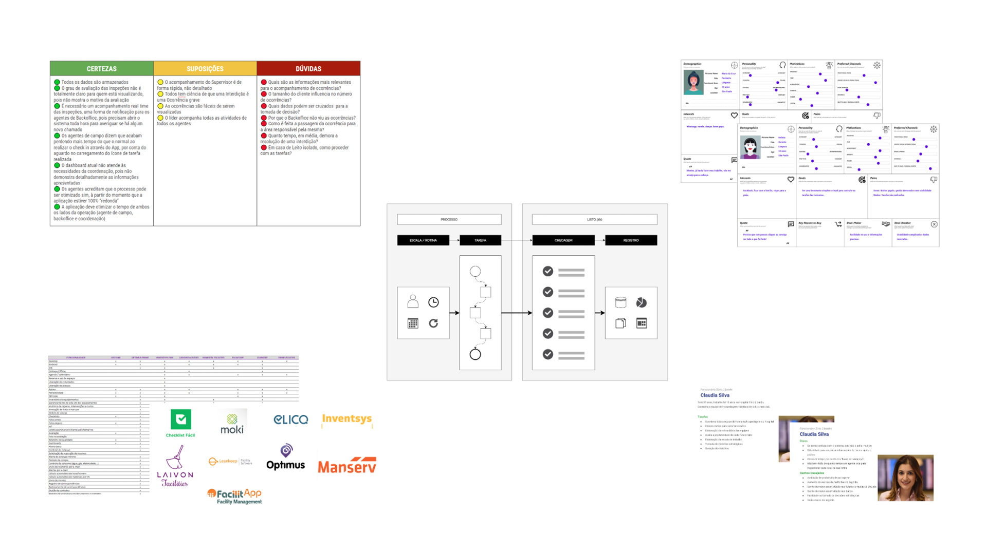
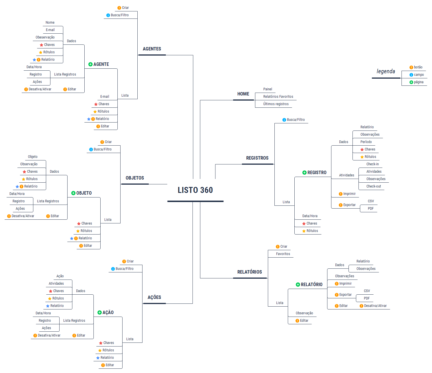
- Audit & mapping: Documented all existing modules, user paths, and pain points
- User-centered IA: Reorganized around user goals, not system structure
- Dashboard hierarchy: Critical alerts surface first; drill-down for details
- Visual consistency: Established patterns for data display across all modules
- Prototype & validate: High-fidelity prototypes tested with real users before handoff
Key Improvements
- Unified navigation: Single mental model across all modules
- Alert prioritization: Critical issues impossible to miss
- Data visualization: Charts redesigned for faster comprehension
- Responsive design: Works on tablets used during facility walkthroughs
Outcome
The redesign received strong praise from the CEO for the clarity and strategic direction of the new information architecture. High-fidelity prototypes were validated with real users before handoff. The project was paused before entering full development due to the COVID-19 pandemic—an external factor that had nothing to do with the quality of the work.
Project Gallery